Brand Standard
Packaging
Leaflet
Digital deliverables
Promotion Videos
Instagram account
CeraVe
Cerave is a rebranding project. Based on CeraVe's existing visual design and brand concept, we reshaped its brand impression.
Design Concept
Because CeraVe emphasizes its world-leading multi-vesicle emulsion technology. Therefore, we continue to use the letter “v”as major visual elements, applying the shape of v to the visual design of each product.
colour
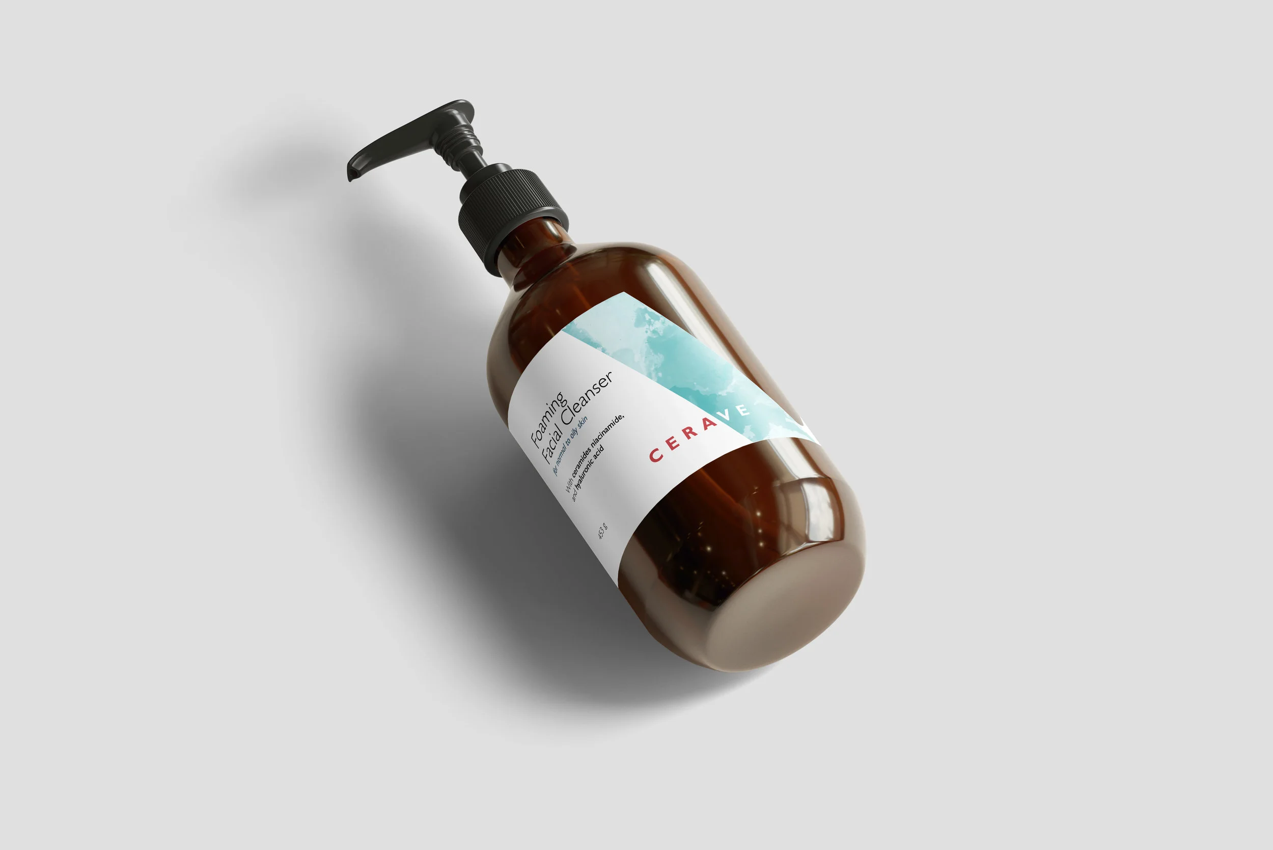
CeraVe's products are mainly used for moisturizing and hydrating, so we chose water cyan and white as the brand's main color scheme. In order to highlight the brand logo without over-magnifying, we added coral red to the font of the logo.
Font
In order to make CeraVe's visual style modern and refined, we chose the slightly British style sans serif font Gill sans as the brand font.
Output (printed media)
We have redesigned the packaging of individual products. A leaflet is also designed for each product, which introduces the product and its use with illustrations.
Output (electronic media)
In addition to the dynamic logo design, we also re-produced two promotional videos for CeraVe for better branding. We have created a virtual CeraVe website and social media platform.
Through the above visual remodeling, we hope that CeraVe can get rid of the original dull brand impression and enhance brand appeal and user stickiness.


